.avif)
Contributors

Subscribe to our newsletter
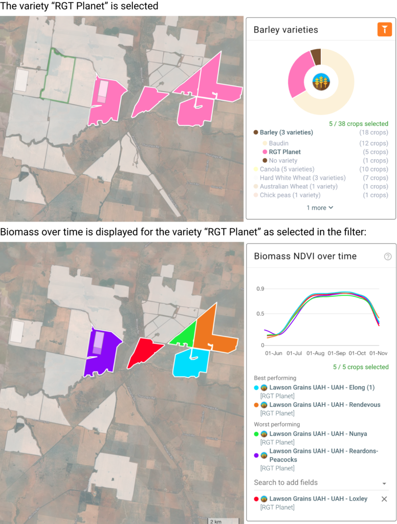
A highly demanded feature was released this month on the crop performance dashboard: the ability to compare your fields' or planting areas' NDVI over time, for field ranking and trial performance assessment.
Selecting the new card "Biomass overtime" will automatically display the 2 best and worst-performing fields/planting areas. Fields are ranked by measuring green biomass production (cumulated NDVI) across the entire growing season.
You can also add additional fields to this comparison by selecting them from the map or the field dropdown. Click on the chart to enlarge it and zoom on specific areas.
The NDVI charts displayed and the field ranking is automatically updated based on the filters set in the cards above (crop type, crop status, crop growth). See the example below:
As always, don't hesitate to reach out to our team with any questions or ideas!